

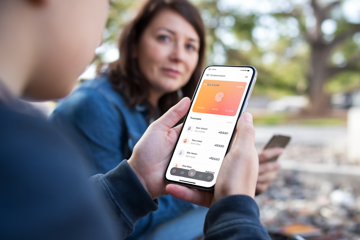
Santander just tore up its mobile app and rebuilt it for iPhone and Android—and here’s the eyebrow-raiser: it’s putting minors front and center. That’s not a typical retail-bank move. But it makes perfect sense if you believe the real fight isn’t over your checking account today—it’s over your kid’s first debit card tomorrow.
The revamp lands a few months after Spanish rival BBVA rolled out its own big redesign. In Europe, as in the U.S., the app has become the bank. Branches are background noise; the phone is the relationship.
One app, one global tech backbone—Santander wants less spaghetti under the hood
Santander is pitching this as part of a broader program it calls “One Transformation,” basically a global effort to standardize the bank’s technology so it isn’t running a different digital machine in every country.
If you’ve ever dealt with a multinational bank, you can guess why. Years of acquisitions leave behind a graveyard of legacy systems. The result: features ship slowly, bugs multiply, and customers in one market get a slick tool while everyone else gets the “we’ll fix it in Q4” version.
A unified tech stack is supposed to mean fewer crashes, faster performance, and updates that don’t require rebuilding the same feature country by country. That’s the promise, anyway. The hard part is threading the needle between standardization and local rules—especially in banking, where regulations and consumer habits change at the border.
The new home screen: fewer tabs, more dashboard
The most obvious change is the home screen. Santander is moving to a single dashboard view that pulls together accounts, cards, and other financial products in one place.
This is the direction the whole industry has been drifting. Most people open a banking app for quick hits: check a balance, scan recent transactions, send a transfer, freeze a card. A fragmented maze of tabs and submenus turns that into a chore—and chores are how customers end up flirting with fintechs.
But there’s a fine line here. A dashboard can be genuinely helpful, or it can become a billboard for whatever product the bank wants to push this quarter. If Santander stuffs the screen with upsells, customers will notice—and they won’t be polite about it in the App Store reviews.
“Mouvements” (transactions) gets the spotlight—because that’s where trust lives or dies
Santander is also leaning hard into the transactions feed—called “Mouvements” in the French write-up—because that’s the screen people actually live in.
This is where banks win or lose credibility: clear merchant names, fast loading, easy scanning, and quick access when something looks off. If your card gets declined or you spot a weird charge, you don’t want a pretty interface. You want answers in under a second.
Santander says the app is faster and clearer. Translation: it’s likely done a bunch of unsexy engineering work—streamlining screens, reducing load times, tightening how data is cached and displayed. Customers won’t care how it’s done. They’ll care whether the transaction list pops instantly or makes them stare at a spinner like it’s 2012.
The real tell: Santander is building for teens (and their parents)
The most interesting part of this redesign is the explicit focus on minors. For decades, big banks treated teen banking like an afterthought—basically a parent account with training wheels. Santander is signaling it wants teenagers as a product segment, not a footnote.
That’s both offense and defense. Offense, because landing a customer early can pay off for years. Defense, because teen-focused fintech products have been eating attention with features that match how young people actually use money: real-time notifications, spending limits, parental controls, and clean transaction views.
And Santander can’t just build for the teen. It has to build for the parent too. The winning formula is usually “freedom with guardrails”: the minor gets a usable experience; the legal guardian gets oversight and settings. In Europe, there’s also the added headache of strict rules around minors’ data and parental consent—so this isn’t just a marketing paint job if Santander is serious.
The risk is obvious: teenagers have zero patience for slow apps and clunky flows. If the experience lags, they’ll bounce—fast—and they’ll tell their friends. Santander is betting it can modernize the basics, roll out a consistent experience across countries, and still keep it relevant locally. The scoreboard will be public: app-store ratings, daily usage, and how many routine tasks customers can do without calling support.